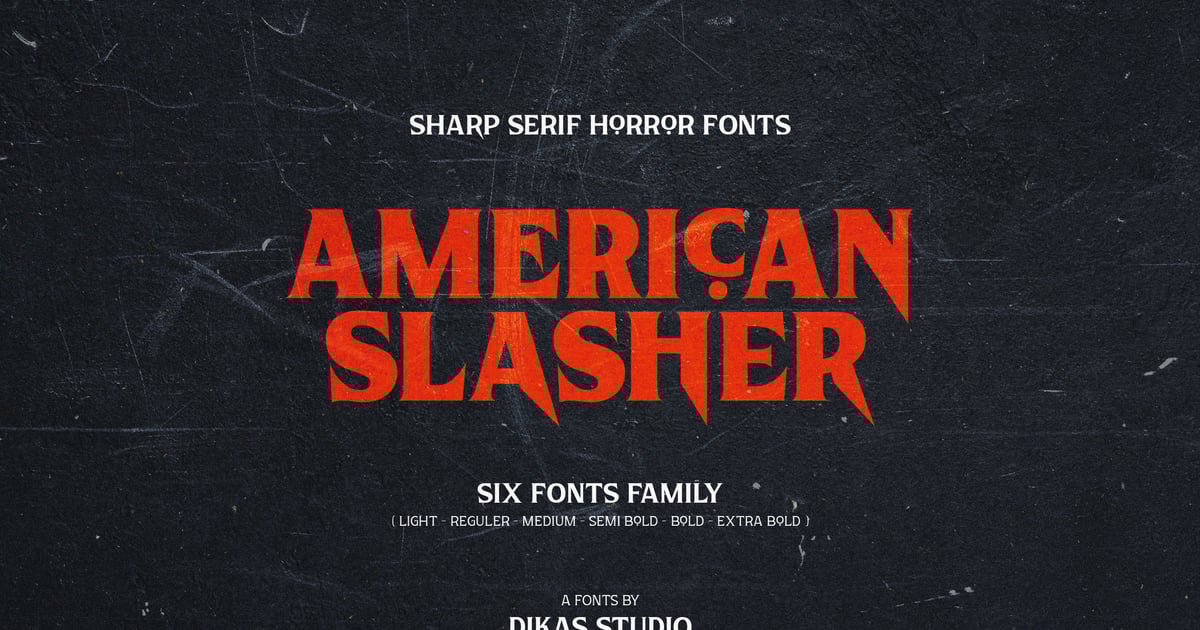
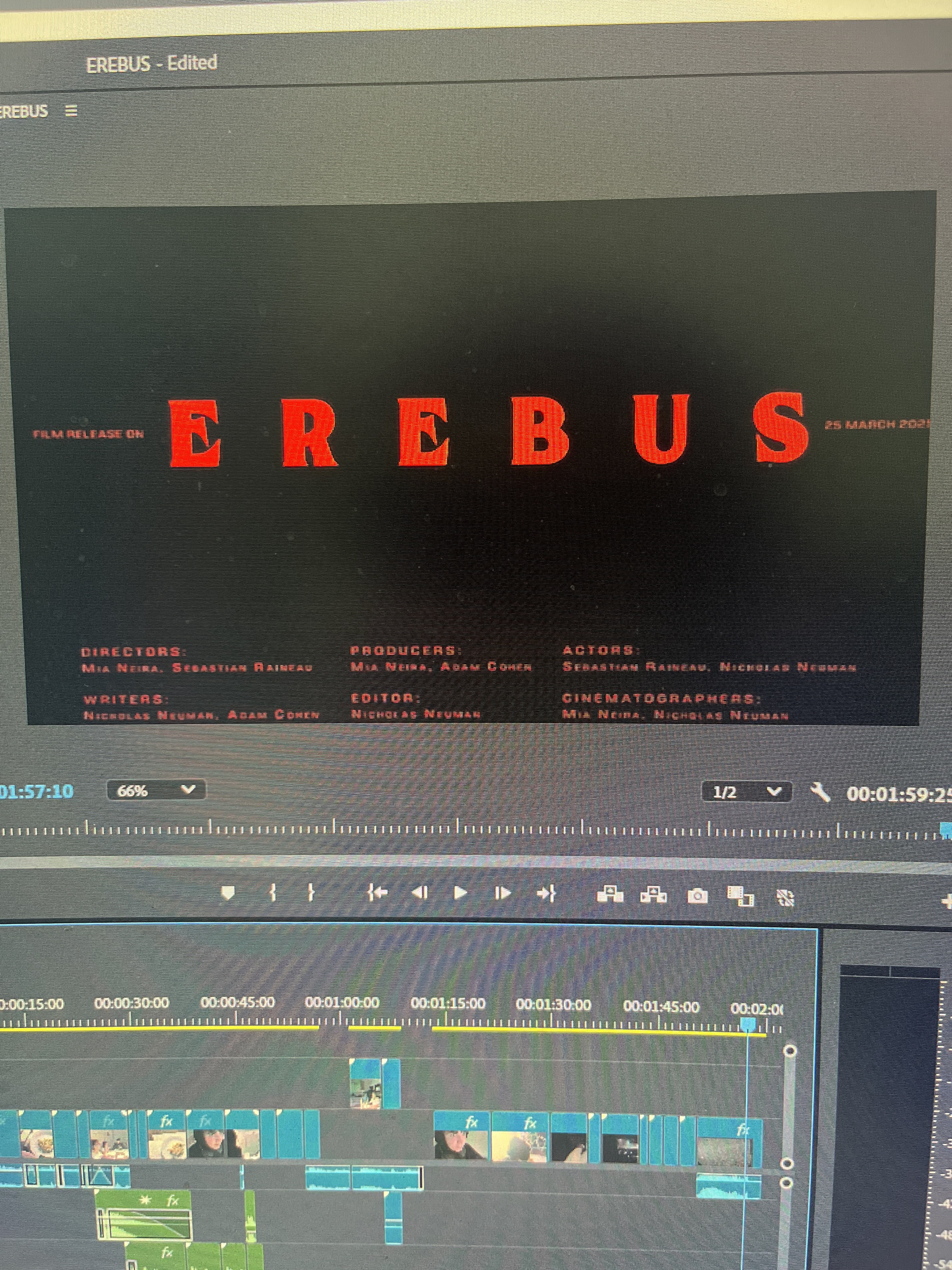
Since our teammate Nico mainly did the editing for the Music Marketing project we had not that long ago he said he got a lot of experience from it and he wanted to do the editing. So he began by choosing the font of the title which we had decided would be red since it is a horror movie and it fits well with the genre. As well as the fact that the title is the name of the demon and it adds to the character. The font seemed suiting and very cool to us so we chose that font, the letters are spaced out and gave the exact mood we wanted for the title and name of the demon.
We chose from the fonts "american-slasher-personal-use", "black-face", "eurocine", and "ncl-enigmatic waesbeniy-demon" we ended up using "american slasher" and "eurocine" for the title card. "American" slasher for the title since it is a horror movie title font and then "eurocine" for the credits.


No comments:
Post a Comment